Parametric Website
I led a redesign of Parametric’s website that increased traffic by over 300%.

Themes
IA
Interaction Design
UI Design
Team
Digital Marketing Team, Developers, and Myself
Tools
Whiteboarding, Workshops, Sketch, Invision, Zeplin
Timeline
3 Months
INTRO
We are Parametric, how can we help you achieve your goals?
We were founded on the principle of discipline. Our focus has been, and will continue to be, providing systematic solutions fueled by investment science.
We can deliver the solutions your clients seek, demonstrate your value, and grow your practice.
GOAL
How might we tell Parametric's story while also guiding users to appropriate information for their type fo clients?
Parametric has two big client bases – Wealth Managers and Institutional clients. These clients have very different goals and requirements and many different products, though there is some overlap.
Once we decided we didn’t want separate sites for these two groups we had to figure out how best to figure out who these users were and guide them to content that speaks to their needs.
Wealth Managers
Wealth managers tend to like less sophisticated products and work with smaller amounts of money for more investors.
Institutional
Institutional clients, such as pension funds and Universities, tend to work with large amounts of investment capital and are very savvy investors.
KEY RESEARCH INSIGHT
There are many different types of institutional investors and wealth managers
The more we talked to our sales and product teams about our users the more we were told that there was much more diversity with the wealth manager and institutional groups than we had previously thought. This led us to rethink where some of those initial pages might lead and what content you might find there. Since we didn’t have direct access to clients we were unable to validate our personas so we had to take a bit of a leap of faith that the information from our internal teams was good.
No Search Functionality
There were hundreds of whitepapers and other resources and no way to search or sort them.
No Sorting or Filters
Whitepapers and articles do not have a function to sort or filter for certain topics or authors.
Content not written for specific groups
Most of the content was too general and not targeted at specific groups needs.
Dated design
Even though it was a fairly recent design and it was a responsive website, the look was dated and not reflective of the companies progressive investment philosophies.

INFORMATION ARCHITECTURE
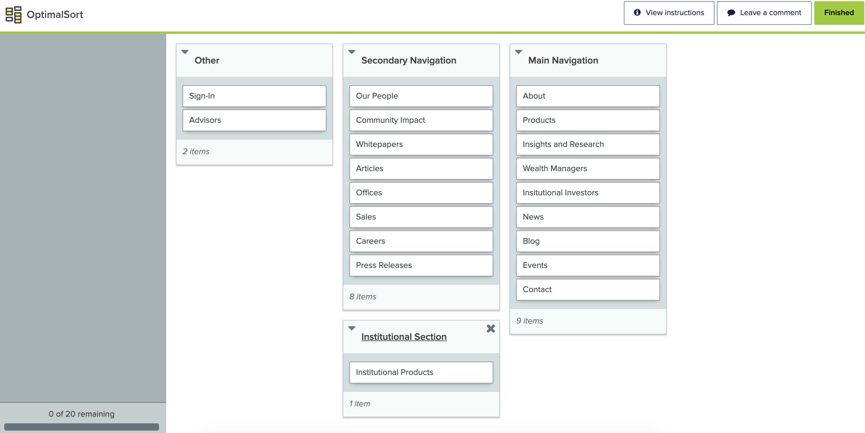
Card Sorting for Navigation
We utilized OptimalSort, which is an online card sorting program. This allowed us to set up some constraints and also to reach out to users in all of our office across the world to gather their input. Before the card sort we had conducted some competitive research to determine some of the names of the various pages and required content for the site.
This helped us zero-in on the content that should appear in the main navigation.
DESIGN DIRECTION
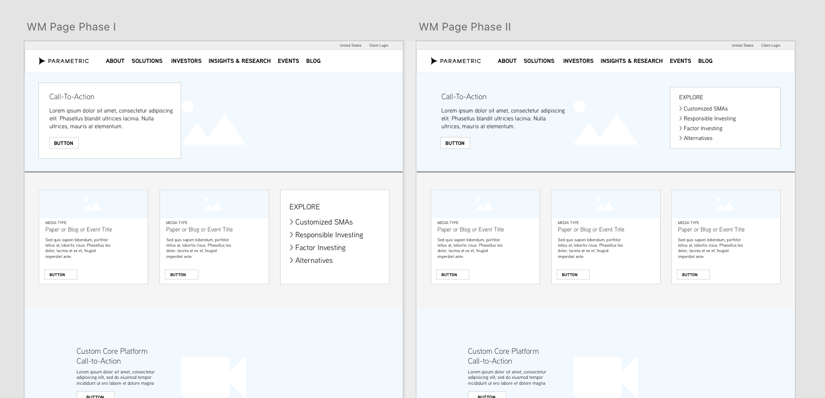
Designing for Flexibility
We did a lot of competitive research on sites such as BlackRock, Charles Schwab, Vanguard, and more to look at design and functionality. Some of the aspects of their designs we liked, such as the mega drop-downs and search, we were ultimately unable to incorporate in our final design due to to development and budget limitations. We opted to create a couple flexible page layouts that could be edited by the marketing team as needed with the CMS, Sitecore.

Reusable components and design patterns
While sketching concepts for the new site I though a lot about reusing components and patterns. These not only made the development process quicker, but it would make the experience better and more familiar for the user.
Since we didn’t have search we developed some sorting and filtering capabilities for the whitepaper and articles.
We decided to incorporate cards as a reusable element in the design. We ended up using them all across the design for our blog and events pages, as well as to highlight related content on products and other pages.
The Launch
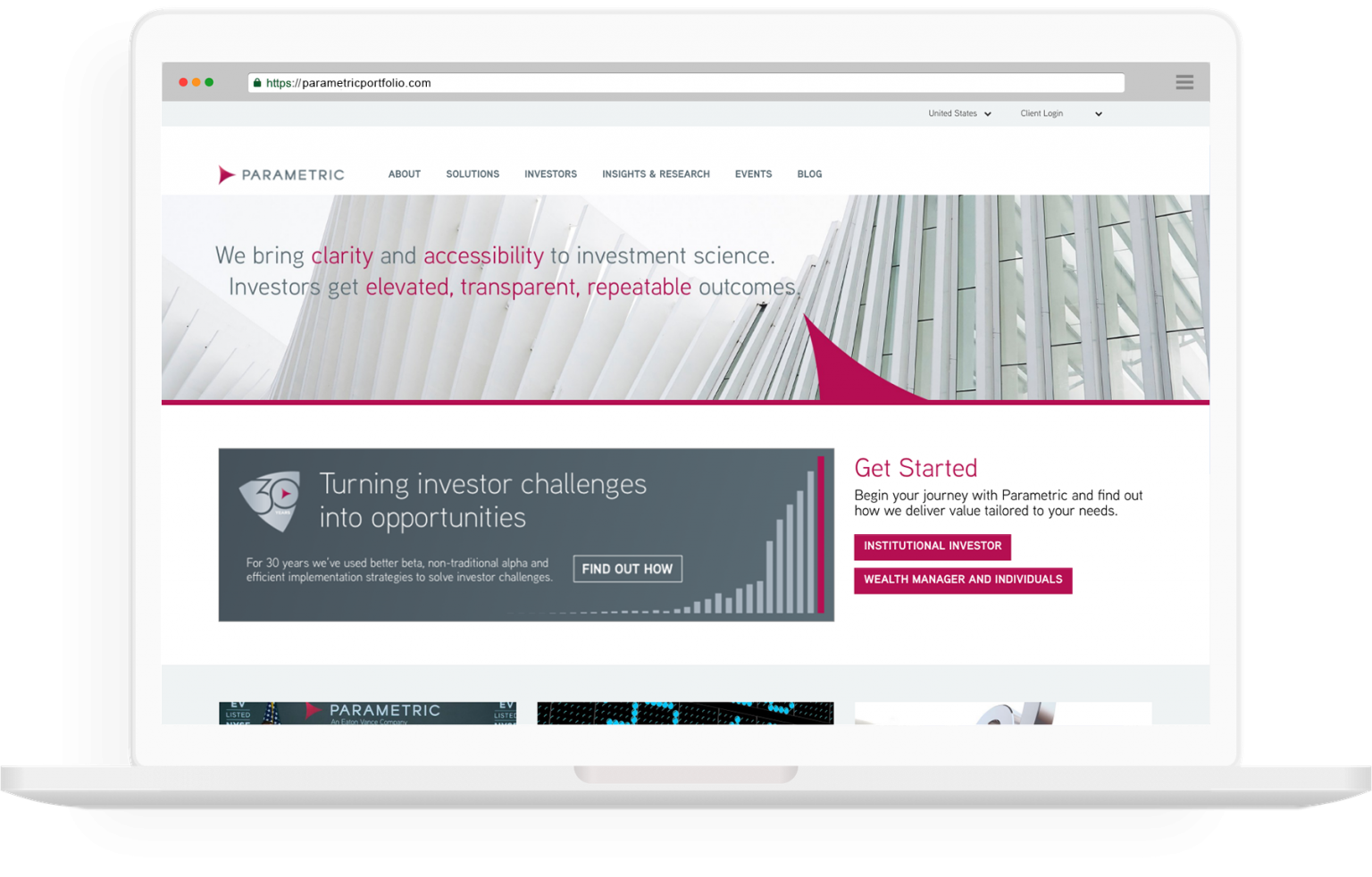
New brand, new website, same company
We launched the new website simultaneously with the rollout of our new branding. This was done at the ringing of the NYSE bell. Both the new branding and website were received well.

Who are you?
We decided to ask users upfront whether they were Institutional or Wealth Managers so we could quickly show them the content and products available to them. We did this with some attention grabbing buttons on the homepage.

Template pages
We developed template pages for content such as our products so that a consistent look could be established going forward. This also made it easier to develop the content for the pages since we knew what was required. Each of these pages included a quick link box to help users quickly find information about a product.

Results + Next Steps
We immediately saw an uptick in traffic and time on page once the new site was launched. Over the first year traffic increased by over 300%. We tweaked the template pages a little here and there to improve them as we began using them on new pages, but overall they made it easier for marketing to develop new content and the faster development rate led to more engagement and better SEO ratings.
The next steps will be to implement elements like search that will improve the user experience and make content easier to find.
